8 Earthy Colour Combinations That Always Feel Warm and Considered
· thehazelcottage@mail.com
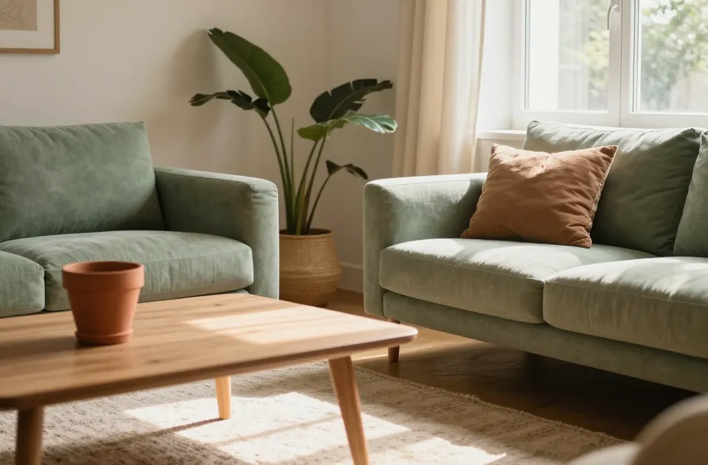
From my first apartment balcony to my current living room upgrade, I’ve learned that earthy palettes feel instantly welcoming when used with intention. You’ll discover eight reliable pairings that bring warmth without shouting, plus practical tips you can apply with standard garden centre finds.
1. Terracotta + Sage Green + Cream: The Grounded Cozy Trio
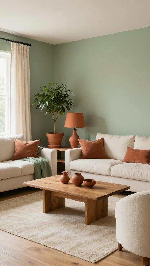
When a space mixes terracotta with muted greens, it reads as rooted and calm. The cream brings airiness to stop the color from feeling heavy.
Signs to Watch For
- Walls or furniture don’t breathe; the room feels dense
- Color clashes appear when sunlight hits surfaces
- Textiles look dull or muddy next to the palette
How to Fix It
- Use terracotta as an accent (an pot, a lampshade) and keep large areas in sage and cream
- Balance with natural wood tones to reinforce warmth
- Choose textiles with small, repeating patterns in the same family
What to Use Instead
- Terracotta pots, sage cushions, and ivory curtains
- A light wood coffee table to anchor the room
Takeaway: Start with a 60/30/10 rule for walls/furniture/textiles to maintain harmony today.
2. Warm Taupe + Olive + Black Accents: Modern Rustic Confidence
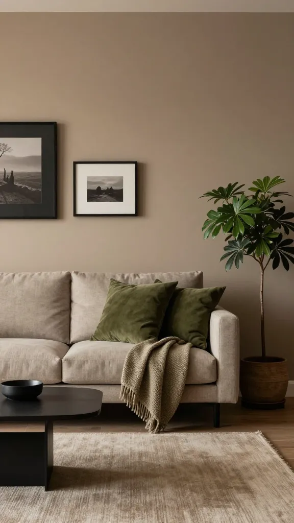
The richness of taupe grounds a space, olive injects life, and black accents provide crisp contrast. It feels sophisticated without being fussy.
Signs to Watch For
- Rooms without contrast look flat under artificial light
- Olive appears muddy rather than vibrant
- Black accents overwhelm the softer tones
How to Fix It
- Keep black elements as small accents (frames, hardware)
- Choose olive items with a warm, yellow undertone
- Introduce a lighter texture such as knitted throws
What to Use Instead
- Taupe walls, olive cushions, tan rug
- Wooden furniture with matte black hardware
Takeaway: Use one bold olive item per room and balance with lighter taupe walls today.
3. Oatmeal + Charcoal + Warm White: Soft, Everyday Neutral
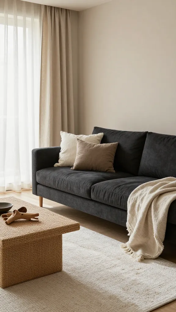
This combination reads as quiet and inviting; it mirrors natural stone and driftwood, making it endlessly versatile.
Signs to Watch For
- Rooms feel sterile when whites are too bright
- Charcoal appears blueish under certain lights
- Textiles don’t pair well with the starkness of white
How to Fix It
- Choose an off-white with a hint of cream and a matte finish
- Use charcoal as an anchor in a few key pieces
- Add texture with natural fibers like jute or linen
What to Use Instead
- Oatmeal walls, charcoal furniture legs, warm white lamp shades
- Rattan baskets to soften edges
Takeaway: Build a visual triangle with oatmeal, charcoal, and warm white for timeless warmth today.
4. Sand + Forest Green + Cream: Quiet Nature Indoors
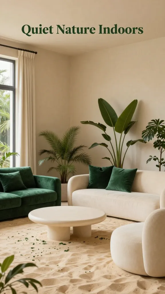
Combining sandy tones with forest green brings nature inside without shouting “outdoor.” Cream adds softness and balance.
Signs to Watch For
- Green tones look flat on certain fabrics
- Sandy walls feel dusty under bright light
- Cream surfaces appear yellowed with time
How to Fix It
- Choose forest greens with a blue undertone for depth
- Use sand as the larger field color and reserve green for accents
- Protect cream surfaces with matte finishes to avoid glare
What to Use Instead
- Sand walls, forest green cushions, cream linen curtains
- Wooden shelves in a light honey tone
Takeaway: Create a three-point color map: sand walls, forest greenery, and cream accents today.
5. Earthen Red + Warm Gray + Beige: Rich Yet Understated
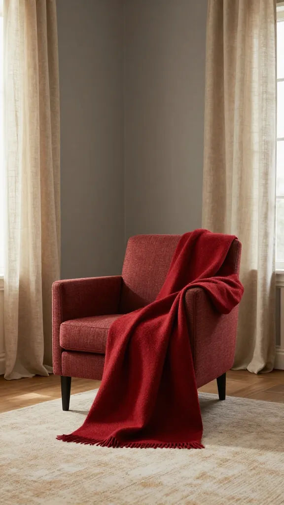
The earthy red brings warmth and personality, while warm gray stabilizes the palette and beige softens the edges.
Signs to Watch For
- Red surfaces look too bright in morning light
- Gray appears cold instead of warm
- Beige fails to tie everything together
How to Fix It
- Pair red with a gray with brown undertones
- Limit red to small furniture pieces or textiles
- Bring in beige via rugs or drapery to soften transitions
What to Use Instead
- Muted red throw pillows, warm gray walls, beige linen curtains
- Natural wood frames to echo the earthy mood
Takeaway: Use red as a feature, gray as a mediator, and beige as a bridge today.
6. Clay + Peach + White: Soft, Sunny Cohesion
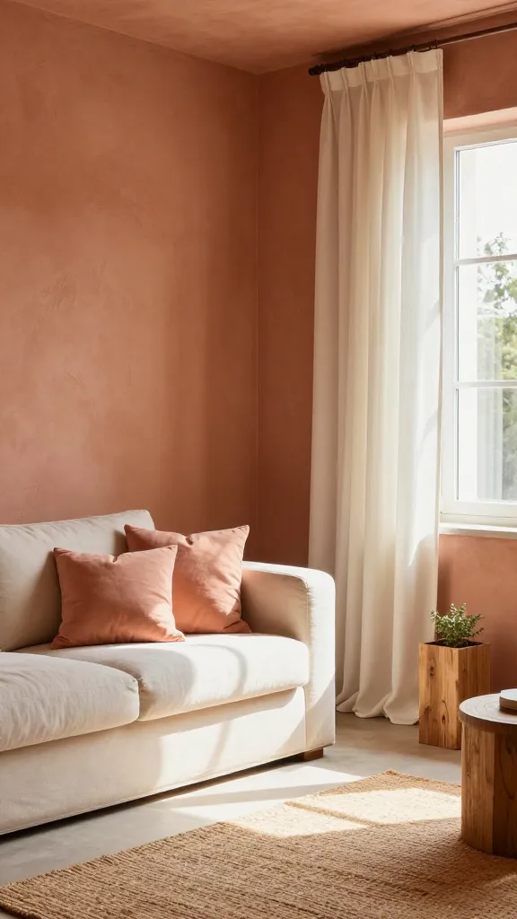
Clay and peach create a gentle, sunlit feel that remains calm with white balancing the brightness.
Signs to Watch For
- Peach tones fade under neon lighting
- Clay looks pinkish in certain rooms
- White becomes stark and clinical
How to Fix It
- Keep peach as a secondary color; let clay dominate
- Choose white with a creamy tint rather than pure white
- Introduce warm textures like cork or wicker
What to Use Instead
- Clay walls, peach cushions, cream drapes
- Wooden planter stands to anchor the palette
Takeaway: Let clay lead, peach highlight, and white soften today.
7. Sage + Mushroom + Brick: Subtle Depth for Small Spaces
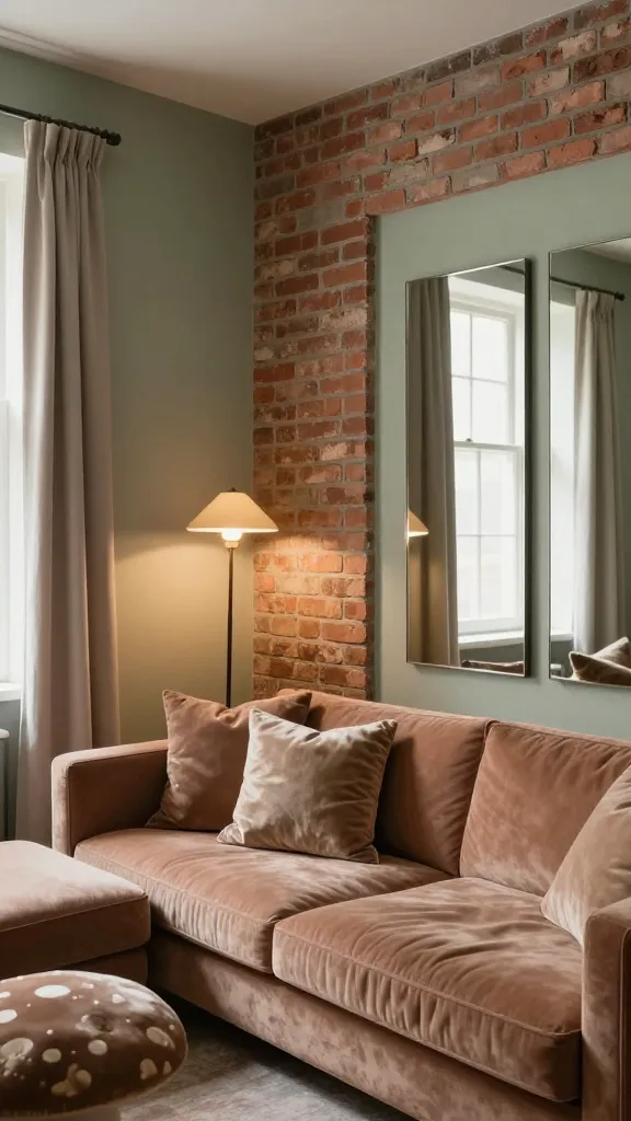
Sage provides calm, mushroom adds softness, and brick injects personality without overpowering a compact room.
Signs to Watch For
- Room feels dim despite light fixtures
- Brick looks orange under certain bulbs
- Sage appears greenish instead of earthy
How to Fix It
- Choose brick in a muted terracotta with grey undertones
- Highlight mushroom with light-reflective fabrics
- Use mirrors to bounce light without brightening the space
What to Use Instead
- Soft sage walls, mushroom upholstery, brick accents
- Light wood furniture to keep the room airy
Takeaway: Build depth with a restrained brick accent and plenty of mushroom textures today.
8. Cocoa + Amber + Off-White: Rich, Welcoming Room Vibes
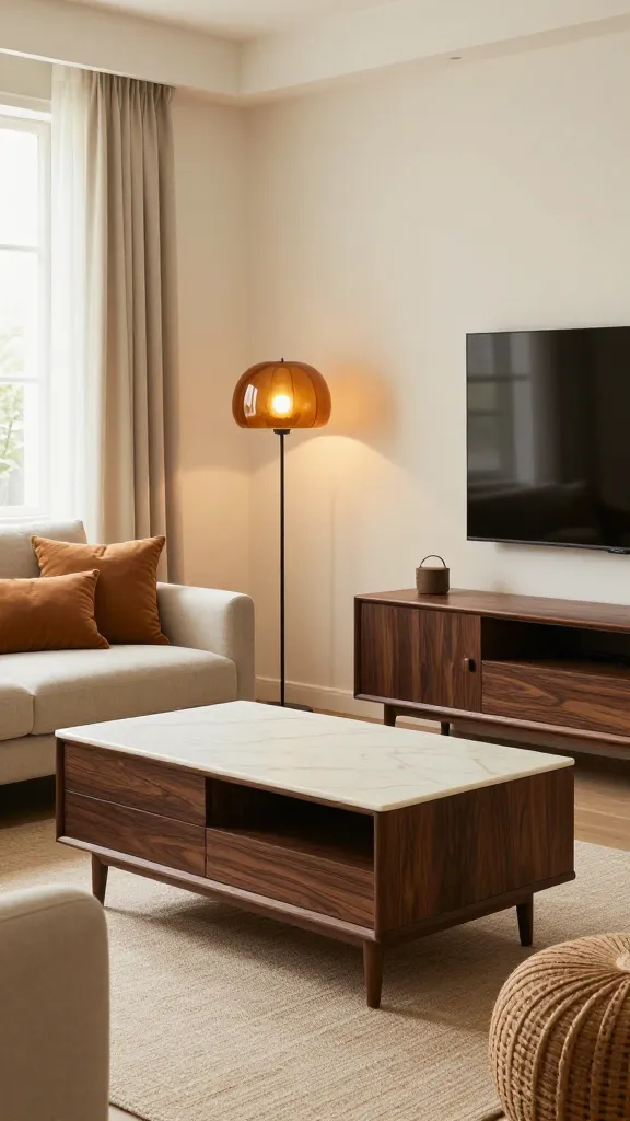
Deep cocoa grounds the scene, amber adds warmth, and off-white keeps contrast gentle and inviting.
Signs to Watch For
- Cocoa surfaces look muddy in dim light
- Amber elements appear too orange after sunset
- Off-white fabrics stain easily and look dirty quickly
How to Fix It
- Protect off-white textiles with a washable finish or choose ivory instead
- Limit amber to a few textiles or a lamp shade
- Balance with a couple of cocoa furniture pieces and lighter walls
What to Use Instead
- Dark cocoa wood, amber glass, off-white linen
- Natural jute rugs to warm the floor area
Takeaway: Use cocoa as the anchor, amber as glow, and off-white as soft relief today.
FAQ
What is the easiest way to choose an earthy palette for my space?
Start with one dominant color (like sage or taupe) and pick two supporting tones from the same warm family. Test fabric swatches in natural light to confirm the warmth before committing.
How many colors should I use in a small room?
Two to three colors plus neutrals is enough. Use the neutrals for large surfaces and bring the warmer tones in through cushions, plants, and decor.
What finishes help keep earthy colors feeling warm instead of flat?
Choose matte or eggshell finishes rather than glossy ones. Textures—linen, wool, jute—add depth that keeps the palette from looking dull.
How do I incorporate these palettes with existing furniture?
Identify one dominant color from your current pieces and align the rest of the room around it. Swap a few textiles or add small décor items in the target palette to tie everything together.
What simple decorating mistakes should I avoid?
Avoid high-contrast combos like pure black and pure white with bold colors; they feel harsher. Also, don’t overwhelm walls with multiple saturated hues—let neutrals balance the space.
Can these palettes work with artificial lighting?
Yes, but test colors during evening lighting. Warm, dimmable bulbs enhance earthy tones, making them feel cozier. If needed, lean on warmer whites (cream not pure white) to maintain warmth.
Takeaway: Use the FAQ to shape your initial palette decisions before buying, then iterate with real samples in your space.
Conclusion
Warm, earthy colour combinations make any home feel welcoming and intentional. Start with one of the eight palettes, test in your lighting, and apply the simple, practical steps outlined above—your space will feel more cohesive and comfortable in days, not weeks.
Leave a Reply